Hi,
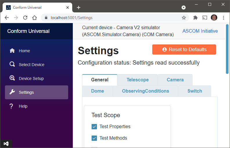
My tabs are working fine with desktop-sized window sizes where there is sufficient space for all 6 tabs to be visible. Tabs are also usable at smaller desktop screen sizes where the nav menu appears to the left because I get a horizontal scroll bar so that I can access the rightmost tabs.
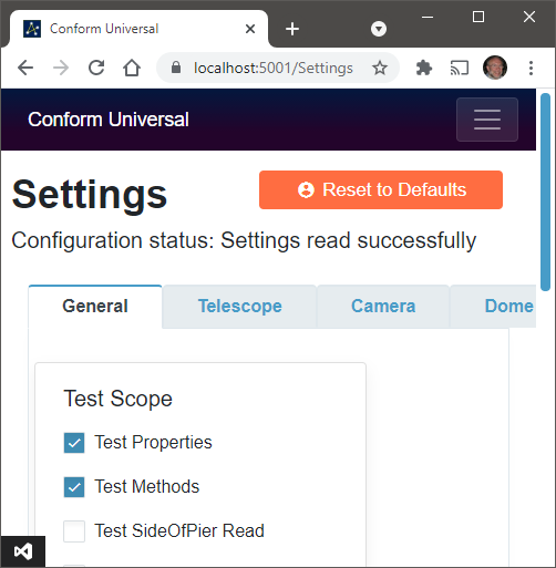
However, in phone sized windows, where the nav section moves to the top of the page, there is no scroll bar and no way to access the two rightmost tabs.
I see that wrapping of tabs was suggested in 2019 (Tab Wrapping Request), is there now a way to enable this or work round the issue?
Many thanks,
Peter

