Hey,
Is it possible to create "wrapper components" from Radzen components? I have now sat for hours trying. The reason for this is that if we, as a company, were to change the component library to something else in the future, it is a little easier to do it in one place instead of in several places in the application.
This is what I have tried:
-
I started a new (solution) where I set up two new projects, one (Razor Class Library) and one (Blazor Web App) project. I referenced the class library in the Blazor project.
-
I installed the Radzen.Blazor nuget package in the class library.
-
I added "@using Radzen" and "@using Radzen.Blazor" to "_Imports.razor" for both projects.
-
I added both:
<link rel="stylesheet" href="_content/Radzen.Blazor/css/material-base.css">and<script src="_content/Radzen.Blazor/Radzen.Blazor.js"></script>in the "App.razor" in the Blazor Web App project. -
I added the services to the "Program.cs" file and the necessary components for these services at the top of "MainLayout.razor" in the Blazor Web App project.
-
I created a component in my Razor Class Library for testing. I named it "LM_Button.Razor". It is the one that I will use as, for example, a (Wrapper component) for RadzenButton.
-
I added this code to the LM_Button.Razor component:
<RadzenButton @attributes="AdditionalAttributes"
              BusyText="@BusyText"
              ButtonStyle="@ButtonStyle"
              ButtonType="@ButtonType"
              Disabled="@Disabled"
              Icon="@Icon"
              IconColor="@IconColor"
              Image="@Image"
              ImageAlternateText="@ImageAlternateText"
              IsBusy="@IsBusy"
              Shade="@Shade"
              Size="@Size"
              TabIndex="@TabIndex"
              Text="@Text"
              Variant="@Variant"
              Click="@Click">
    @ChildContent
</RadzenButton>

@code {
    [Parameter] public string BusyText { get; set; }
    [Parameter] public ButtonStyle ButtonStyle { get; set; }
    [Parameter] public ButtonType ButtonType { get; set; }
    [Parameter] public bool Disabled { get; set; }
    [Parameter] public string Icon { get; set; }
    [Parameter] public string IconColor { get; set; }
    [Parameter] public string Image { get; set; }
    [Parameter] public string ImageAlternateText { get; set; }
    [Parameter] public bool IsBusy { get; set; }
    [Parameter] public Shade Shade { get; set; }
    [Parameter] public ButtonSize Size { get; set; }
    [Parameter] public int TabIndex { get; set; }
    [Parameter] public string Text { get; set; }
    [Parameter] public Variant Variant { get; set; }
    [Parameter] public EventCallback<MouseEventArgs> Click { get; set; }
    [Parameter] public RenderFragment ChildContent { get; set; }
    [Parameter(CaptureUnmatchedValues = true)] public IDictionary<string, object> AdditionalAttributes { get; set; }
}
- When I then use my new component that is a copy of RadzenButton like this:
<RadzenStack Orientation="Orientation.Horizontal" AlignItems="AlignItems.Center" Gap="1rem" Wrap="FlexWrap.Wrap">
    <RadzenButton Text="Primary" ButtonStyle="ButtonStyle.Primary" />
    <RadzenButton Text="Secondary" ButtonStyle="ButtonStyle.Secondary" />
    <RadzenButton Text="Info" ButtonStyle="ButtonStyle.Info" />
    <RadzenButton Text="Success" ButtonStyle="ButtonStyle.Success" />
    <RadzenButton Text="Warning" ButtonStyle="ButtonStyle.Warning" />
    <RadzenButton Text="Danger" ButtonStyle="ButtonStyle.Danger" />
</RadzenStack>

<RadzenStack Orientation="Orientation.Horizontal" AlignItems="AlignItems.Center" Gap="1rem" Wrap="FlexWrap.Wrap">
    <LM_Button Text="Primary" ButtonStyle="ButtonStyle.Primary" />
    <LM_Button Text="Secondary" ButtonStyle="ButtonStyle.Secondary" />
    <LM_Button Text="Info" ButtonStyle="ButtonStyle.Info" />
    <LM_Button Text="Success" ButtonStyle="ButtonStyle.Success" />
    <LM_Button Text="Warning" ButtonStyle="ButtonStyle.Warning" />
    <LM_Button Text="Danger" ButtonStyle="ButtonStyle.Danger" />
</RadzenStack>
- I get two completely different results:
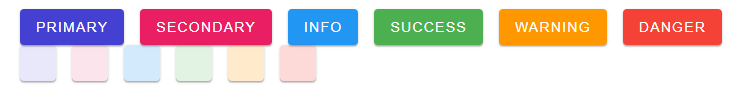
Did I miss something important?
Thanks in advance.