Unable to make Horizontal Menu Responsive

I'm brand-new to Radzen (today) so I may just be missing something obvious. I am unable to make the Radzen horizontal menu collapse to the bootstrap hamburger menu.

Steps:
I have created an out-of-the-box Blazor Server project.
I've pasted several different RadzenMenu code samples into the NavMenu.razor page.

  • from here, the menu disappears on smaller screens along with the LoginDisplay.

Removed the menu from the NavMenu.razor page and pasted it into MainLayout.razor in place of the tag.

  • Now the menu displays and does not disappear on smaller screens, but it is not responsive. It does not collapse, or stack as I would expect a bootstrap(4) menu to do.

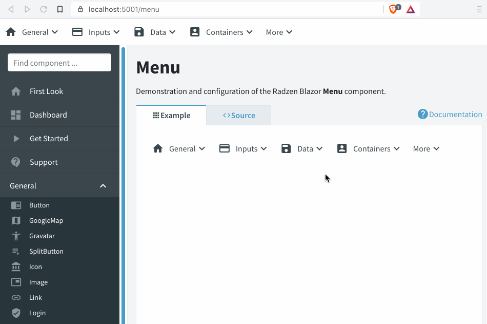
Is there a code sample of how to incorporate the RadzenMenu into an out-of-the-box Blazor Server project? Basically all I want is to elminate the sidebar menu in favor of a horizontal menu.

1 Like

The RadzenMenu doesn't have a responsive mode yet. It will render the same no matter the device. We will address that in a future release.

Ah!! Okay, that explains why I'm not able to make it behave the way I'm expecting. :rofl:

Thanks for the feedback.

Is this still the case?

I also would like to have this also.(For Angular)
Best,

Yes, this is still the case. We haven't made any changes in this regard.

Menus being responsive is a must have feature, it is surprising that radzen does not have it yet!

Just found this myself today. Menu renders as a single block and does not wrap. Unable to use this in a standard bootstrap navbar because of this issue. are there any work arounds?

@korchev is there any solution for this that we can use right know?

We just implemented support for that and it will be available with the next version.

In which NuGet package version will this be available?
I'm currently trying to implement it.

And do you have a code example how to create a horizontal menu which will collapse to a hamburger menu? Or is it just plain css?

And how will the menu look like on smaller screens? When pressed on the hamburger menu button will a vertical menu be shown as an overlay over the page? Or will this also be customizable using css?

Check the latest NuGet:

Thanks @enchev it is working as I need it.

I'm implementing it in my app and I'm having trouble matching my design.
I have a toolbar on top of my page. On the left is my logo, then some negative space, and then the menu aligned to the right. This is fine.
But when I start making my screen smaller it takes too long before the menu collapses because of the logo. How to set the collapse moment?

I'm also having trouble getting rid of the white background the menu is showing. Personally, I don't think it is a good idea if a component sets this intrusive styling.

My NawMenu.razor:

<header>
    <div id="logo-menu">
        <a href="index.html">
            <img src="img/logo.png" alt="logo">        
        </a>
    </div>
    
    <nav>
        <RadzenMenu>
            <RadzenMenuItem Text="Home" Path="/" Icon="home" class="nav-item-active"></RadzenMenuItem>
            <RadzenMenuItem Text="Foo1" Path="/foo" Icon="euro_symbol"></RadzenMenuItem>
            <RadzenMenuItem Text="Foo2" Path="/foo" Icon="groups"></RadzenMenuItem>
            <RadzenMenuItem Text="Foo3" Path="/foo" Icon="topic"></RadzenMenuItem>
            <RadzenMenuItem Text="Foo4" Path="/foo" Icon="supervisor_account"></RadzenMenuItem>
            <RadzenMenuItem Text="Foo5" Path="/foo" Icon="account_circle"></RadzenMenuItem>
        </RadzenMenu>
    </nav>
</header>

My NawMenu.razor.css:

header {
    display: grid;
    grid-template-columns: auto 1fr;
    justify-items: end;
    align-items: center;
    max-height: none;
    background: var(--secondary-07);
    box-shadow: rgba(0, 0, 0, 0.2) 0 20px 30px;
}

#logo-menu {
    align-self: start;
}

nav {
    font-family: "Nunito Sans", "Lucida Sans", sans-serif;
    font-weight: 700;
    font-style: normal;
    letter-spacing: 0.18em;
    text-transform: uppercase;
}
    nav > ul {
        background-color: unset !important; /* Radzen override, not working*/
        padding-left: 1rem;
        padding-right: 1rem;
        font-size: 1rem;
    }

#logo-menu img {
    max-height: 5rem;
    min-width: 256px;
}

So my questions:

  1. How to make the menu recognize my logo so it will collapse correctly?
  2. How to style the component, for example, the background color?

The answer to both questions is to update the CSS to match your needs. Use your browser's developer tools to find the required CSS rules and override them in your application css file.