Hello everyone,
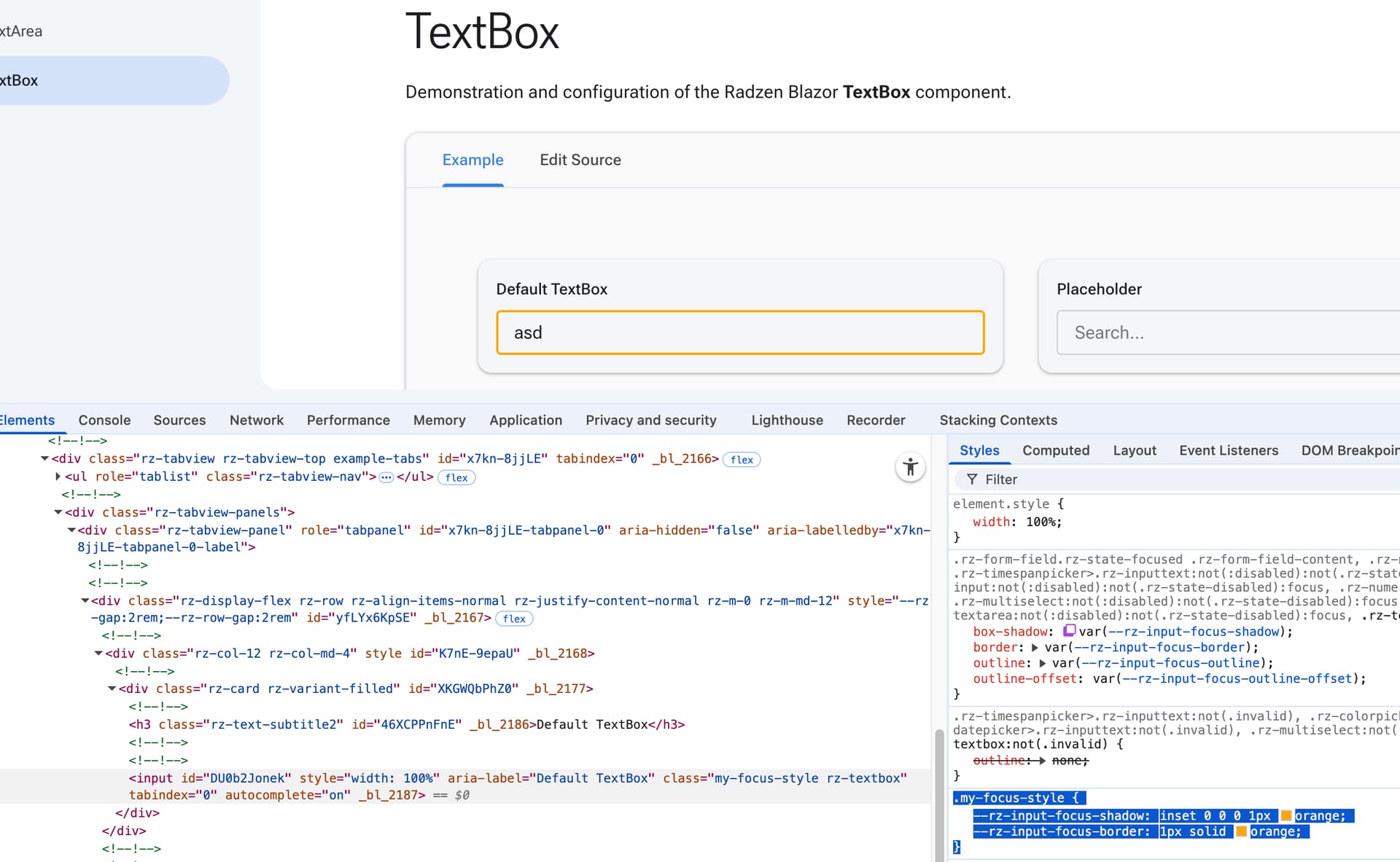
I'm trying to apply a consistent orange focus border to my Radzen input components (Datepickers, Numerics, normal Inputtexts, and Dropdowns). I've achieved this with the following CSS:
/* Consistent CSS-Design for Borders in Radzen-Input-Components */
.rz-dropdown:not(:disabled):not(.rz-state-disabled):focus, /* for dropdowns */
.rz-inputtext:not(:disabled):not(.rz-state-disabled):focus, /* without this line datepickers, numerics & searchfields (also in dropdowns) wont be orange... but textfields are still orange */
.rz-textbox:not(:disabled):not(.rz-state-disabled):focus { /* for normal textfields */
    box-shadow: inset 0 0 0 1px var(--nerd-orange) !important; /* without this, the shadow stays default */
    border: 1px solid var(--nerd-orange) !important; /* without this, the border stays default (very thin) */
    border-radius: var(--rz-border-radius) !important; /* without this numerics and searchfields have corners, the rest isn't affected */
}
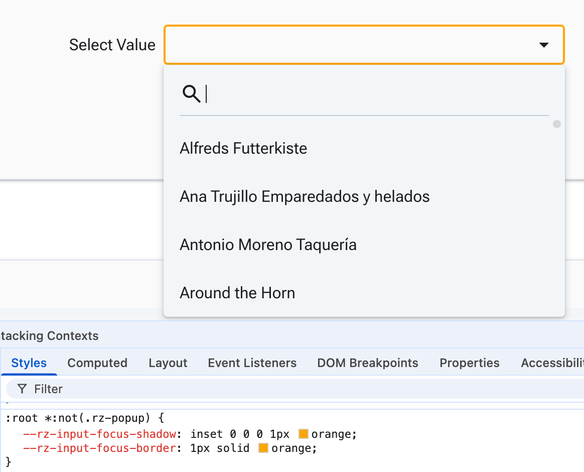
However, I'm encountering an issue with Search fields. These Search fields appear both as standalone components (which I don't want to style with the orange border) and within Dropdown components. Currently, they are also getting the orange focus border, as shown in this image:
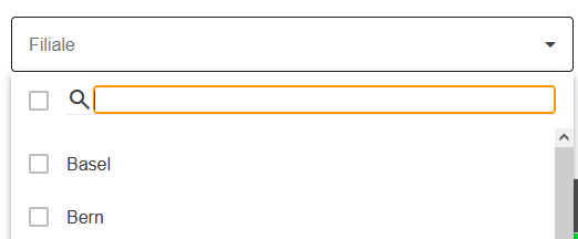
the same occurs for following component:
Ideally, only Datepickers, Numerics, normal Inputtexts, and the main Dropdown element should have the orange focus border. Search fields (whether standalone or within a Dropdown) should retain their default focus style.
The only way I've found to remove the orange border from the Search fields is by removing the .rz-inputtext:focus line:
.rz-inputtext:not(:disabled):not(.rz-state-disabled):focus,
But this unfortunately also removes the orange border from my Datepickers, Numerics, and normal Inputtexts, which is not the desired outcome.
How can I modify my CSS to achieve the orange focus border on Datepickers, Numerics, normal Inputtexts, and Dropdowns, while ensuring that Search fields (standalone and within Dropdowns) retain their default focus styling?
Any help or suggestions would be greatly appreciated!
Thank you.