Hi,
I'm playing with RadzenDataGrid component and I've spotted some issues with user layout accessibility when there are a lot of columns in the grid. I would like to ensure that user will see as much column name as possible while sorting and filtering feature is enabled. Is it possible to change easily layout so that Sorting and Filtering icons will be below column title instead of placing them at the right side of column title? It would bring much more space to display column names. I understand that some users might be happy with current layout so my question actually is: how to change it easily? Is there any flag like "SortingAlignment/FilteringAlignment" or there is no such feature available? If not then how to achieve it?

Hi @DejaVu,
We might consider the introduction of such flag. Meanwhile, you can try adding this CSS to see if it gets better in your use case:
.rz-grid-table thead th>div:not(.rz-cell-filter) {
    flex-direction: column;
}

.rz-grid-table thead th .rz-column-title {
    flex-wrap: wrap;
}
Thank you for your feedback! First impression is that it doesn't look well, but it changes alignment behavior. I will play more with it tomorrow. Anyway if you think that this feature sounds good for Radzen then I would be happy to use product flags/properties to modify behavior rather than implementing workarounds.
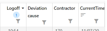
This is how it looks after applying suggested CSS. As you can see it looks ugly, so I guess Radzen component should be extended to ensure pretty header layout.
The best would be just to be able to define where elements should be presented in HeaderTemplate. For example something like this:
            <HeaderTemplate>
                <ClickableLabel>Actual<br />start</ClickableLabel>
                <br />
                <SortIcon />
                <SortOrderIcon />
                <FilterIcon />
            </HeaderTemplate>
With such implementation user would be able to create any possible layout. But I guess you might have much better idea how such feature should be implemented to keep Radzen usage simple.