Good morning,
i got a question about using RadzenDropDown on mobile devices.
The popup is currently closed by the RadzenDropDown when the view is scrolled.
Situation:
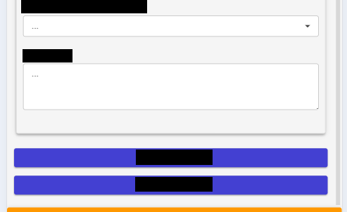
The bottom of the view looks like this:
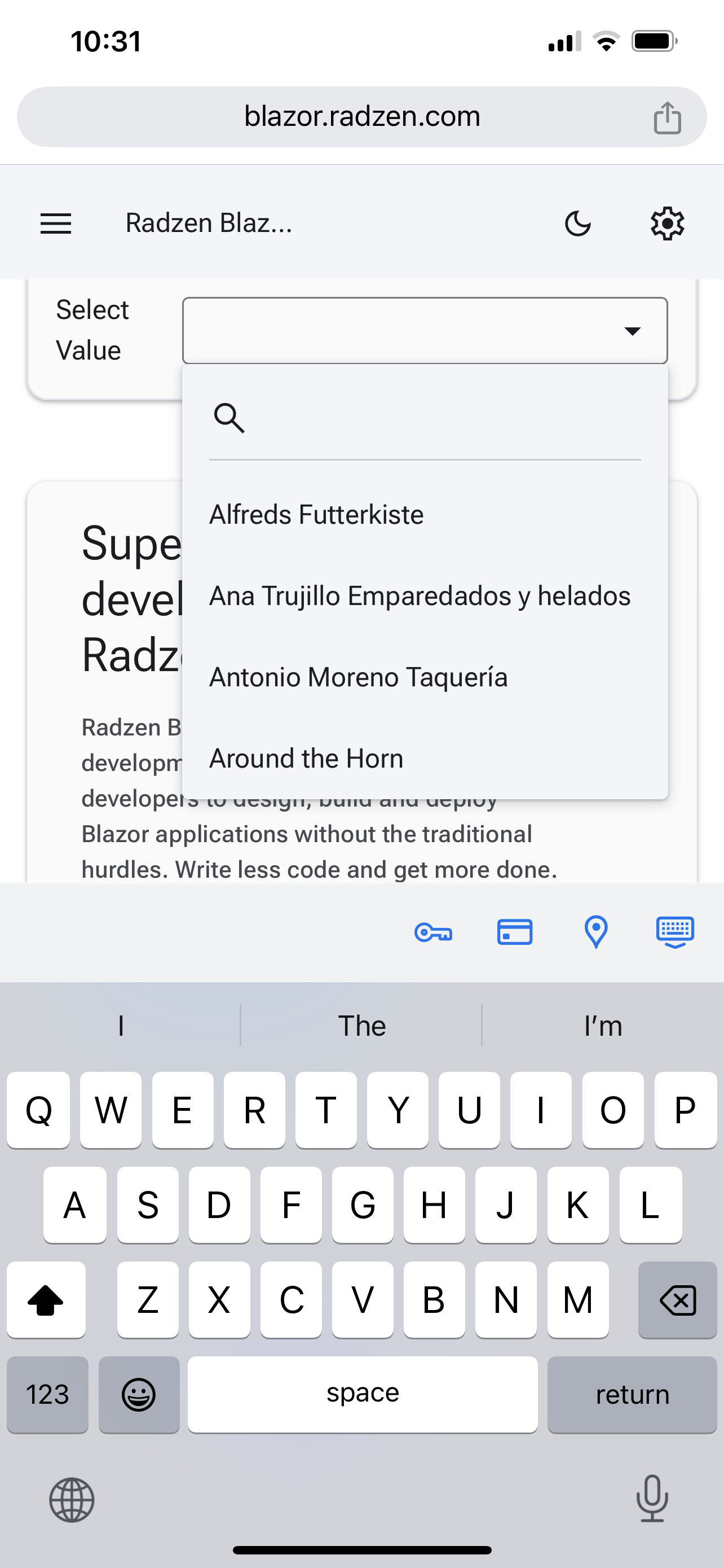
When the user focus the RadzenDropDown the popup opens and the keyboard is visible too:
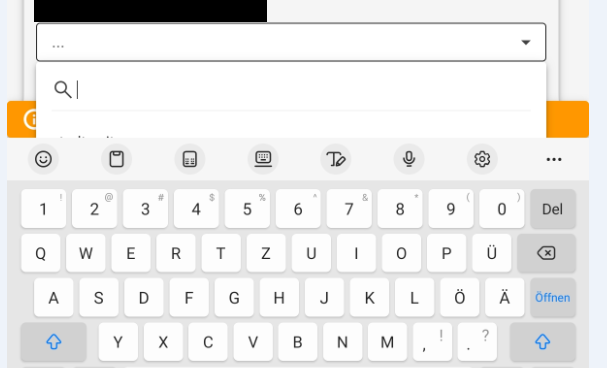
The users dont know how to scroll now. I get this feedback alot lately. I am aware that it is possible to solve the "issue" if they scroll within the popup. I verified that by myself. The current users dont really know this behaviour of the RadzenDropDown as the space of the popup in this situation is so small.
Maybe im missing something but i have no solution right now.
Looking forward for any feedback.
Thanks in advance.
Best regards