This menu works well in full windows, but when it's small enough that the whole menu collapses, it won't open on small windows and mobile
<RadzenMenu class="rz-menu-top">
   <RadzenMenuItem Text="Horaire" Icon="event" Path="schedule">     </RadzenMenuItem>
      </RadzenMenu>
Hi @xcheshirecat,
The menu is responsive by default. You can use <RadzenMenu Responsive="false"> to disable the responsive styling.
I tested your code in the online demos and it works as expected with enabled responsiveness:
yeah, it works for me in the demo as well... so why is it not working. I even have 2 blazor app with the same issue
What version of Radzen.Blazor are you using? It could be old where this feature isn't implemented yet.
I just installed latest stable and it's doing the same thing
If I do that, i can't get to all the menu items
We are not sure why it isn't working in your application. If you manage to reproduce the issue in our online demos (they are editable) do let us know and provide the required source code.
its working in the demo page, how can i find how it's not working in my app. the 2 blazor apps have the same problem
You can try using the browser's developer tools and inspect the CSS that are applied to the menu. You should see something like this in the working case:
This CSS rule is crucial:
@media (max-width: 768px) {
    .rz-menu:not(.rz-profile-menu) .rz-menu-toggle-item {
        display: flex;
    }
}
it's there, is there anything else to search for
Is there any live URL where we can check this app? That's the only thing that comes to mind.
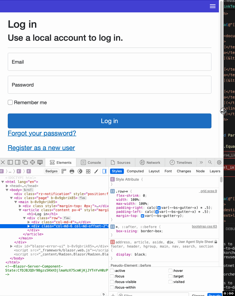
The <main> element has its width set to 0. This seems to be causing the problem.
yeah but that's not the issue i was having, the menu still won't open
Make sure you have interactivity enabled for that page. Without it Blazor won't fire events.
As I stated above, all those pages are already at server interactivity, and the page functions well. It's really just the menu collapsing that doesn't work

