Hello All,
The bar chart seems to have an odd behavior when rendering under different culture settings. Under the standard culture settings (en-US), the bars render as expected:
However, when the culture is switched to some other settings (like fr-CA), the bars render oddly, specifically with the empty space under the bar filled in:
This doesn't happen for all cultures which are selectable. At this point, we support 6 different culture settings in our application, but this behavior only happens for French (Canada) and German (Germany), fr-CA and de-DE.
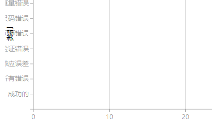
Another odd behavior in rendering occurs when we switch to simplified Chinese (zh-Hans), where the category axis title is displayed overlapping the category labels, whereas in all other of our supported cultures, there is a space rendered between the labels and the axis title:

I guess the question is, does culture affect the rendering of the bar charts? If so, are there plans for correction to make sure that the rendering is the same or similar for all culture selections?

