Hi Team,
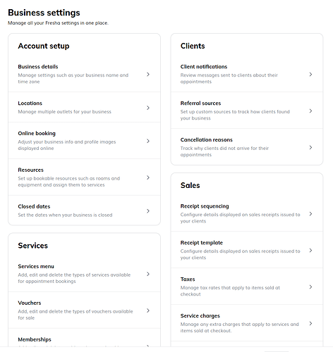
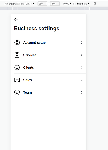
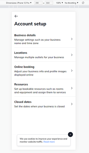
I've build a website using Radzen which is works good. I am now in process of making it mobile friendly. I have a settings page with lot of menus. I am looking at the new Radzen Stack/Row/Column components to achieve something like following. Screenshots are from some other reference website.
On Desktop:
On Mobile:
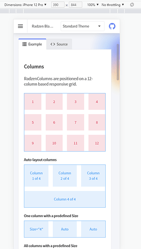
I'm not able to find the right combination yet. For example, the Auto-Layout columns remains as boxes instead of becoming rows for mobile screens.
Can you please suggest if similar interface is possible using a Radzen component. Thank You.


