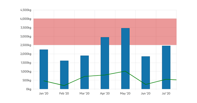
I've been tasked with providing a highlighted area the width of the graph depicting the HIGH and LOW thresholds. For instance, if we have a line representing temperature there would be a static line running the width of the graph with its area fill being a color I choose, I would need one above the temperature line for the EXCESSIVE HIGH and one below the temperature line for EXCESSIVE LOW with it's own fill color, I would set the numbers via code. This would allow the user to see at a glance if the temperature is optimal. I have tried everything I can to do this and apart from just using a different graph control (I like Radzen too much) I was hoping somebody has already solved this thorny issue.
This chart shows what I want, the pink area is what I need on a LineSeries chart and the ability to define more than one per chart for HIGH and LOW
I was able to solve this not exactly the results I wanted but actually I think it's much better than I was hoping for. @korchev is there anyway I can set the new thick lines to 50% transparent? I tried all the HTML tricks but nothing worked.

