I’ve noticed two issues related to the RadzenDropDownDataGrid component:
Cursor behavior
When hovering over a RadzenDataGrid, it’s possible to override the cursor style using CSS like this:
Style="cursor: default"
however, this does not work for the RadzenDropDownDataGrid. The cursor remains as text (I-beam) even when hovering over the grid cells. In the context of a dropdown, I don’t think text selection should be necessary or expected, so it would be great if the cursor could be set to default or pointer, and that CSS overrides worked similarly to RadzenDataGrid.
Selection highlighting
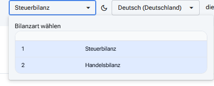
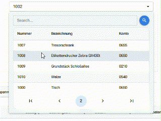
The RadzenDropDownDataGrid seems to remember previously selected items and highlights them in blue when the dropdown is opened again. After switching the selection several times, multiple items remain highlighted (in blue), which can be confusing, as it visually suggests that more than one option is selected — even though only a single value is actually bound.
Regarding the first issue: I realize I didn’t clarify that I’m not using a separate CSS file — I’m applying styles directly via the Style="..." attribute in the component markup. I apologize for not mentioning this earlier. Given that, I’m wondering if your suggestion using:
.dropdown-label {
    cursor: default;
}
would still have any effect in my case? Does defining it in a CSS file (as I assume you meant, since you did not specify) behave differently than setting the style directly on the component? I’m trying to understand if there’s something I’m missing, or if the component is perhaps ignoring inline styles for some reason.
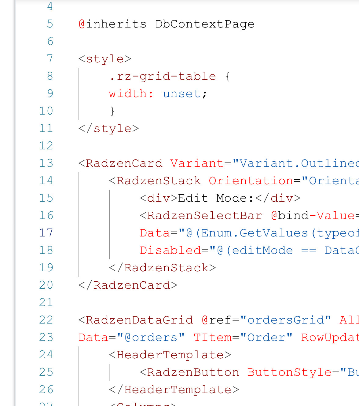
As for the second issue — the selection highlighting — I’ll extract the relevant part of my RadzenDropDownDataGrid code and post it here shortly so you can try to reproduce it.
You don’t have to add the class - it’s already there and it styles the value label. Use your browser dev tools inspector to check what other classes are used if you want to style them as well.
Thanks for the clarification and your hint using the browser dev tools.
I was able to achieve the desired behavior by adding the following to the block at the top of my .razor file:
.rz-data-row {
    cursor: default;
}
This ensures that the cursor doesn't change to a text selection (I-beam) when hovering over the rows in the RadzenDropDownDataGrid.
Initially, I assumed .dropdown-label would affect the rows as well, but it seems it only applies to the value label of the dropdown. Just mentioning this in case others run into a similar situation — targeting .rz-data-row was ultimately the solution in my case.