DropDown Multiple Chip Color?

Dear Team Radzen,

I wonder if you are planning adding a color option specifically for the DropDown’s multiple with chips.

I tried a workaround by setting it to chips with multiple and adding a RadzenBadge to it, but it creates a chip inside a chip and the outer will always be a default color. It would be a nice option for the chips to be able to represent the base colors. Or I wonder if you have a working solution approach as of right now.

This is how I’ve tried:

<RadzenDropDown TItem="TItem"
                TValue="List<TItem>"
                Data="@Data"
                Multiple="true"
                @bind-Value="@Value"
                TextProperty="@TextProperty"
                Placeholder="@Placeholder"
                AllowClear="false"
                AllowFiltering="true"
                Culture="System.Globalization.CultureInfo.InvariantCulture"
                AllowSelectAll="false"
                FilterCaseSensitivity="FilterCaseSensitivity.CaseInsensitive"
                Chips="true"
                MaxSelectedLabels="Int32.MaxValue"
                Change="@OnValueChanged"
                Disabled="@Disabled"
                Name="@Name">
    
    <ValueTemplate Context="item">
        <RadzenBadge BadgeStyle="BadgeStyle.Primary" IsPill="true" Shade="Shade.Darker">
            <span>@GetItemText(item)</span>

            @if (ShowNavigateButton)
            {
                <RadzenButton Icon="link"
                              Size="ButtonSize.ExtraSmall"
                              ButtonStyle="ButtonStyle.Info"
                              Disabled="@(!EnableNavigateButton)"
                              Click="() => HandleNavigateClick(item)"
                              @onclick:stopPropagation
                              title="Navigate to item"/>
            }

            @if (ShowOpenPopupButton)
            {
                <RadzenButton Icon="open_in_new"
                              Size="ButtonSize.ExtraSmall"
                              ButtonStyle="ButtonStyle.Info"
                              Disabled="@(!EnableOpenPopupButton)"
                              Click="() => HandleOpenPopupClick(item)"
                              @onclick:stopPropagation
                              title="Open in popup"/>
            }
        </RadzenBadge>
    </ValueTemplate>
</RadzenDropDown>      

And it created something like this with material theme:

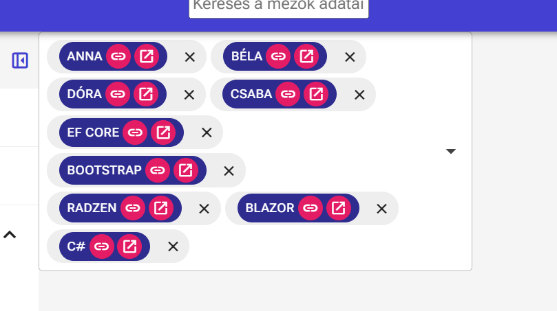
It is almost OK, I could set it to one color with global css, but it would be nice of setting the chip colors as a template parameter, we will be needing different color chips in one dropdown. Your help would be appreciated.

Thank you,
Csaba

Hi @Csaba_Sinko,

You can use CSS pseudo-classes to style your chips:

.rz-dropdown-chips .rz-chip:nth-of-type(1) {
    --rz-chip-background-color: red;
    --rz-chip-color: white;
}

.rz-dropdown-chips .rz-chip:nth-of-type(2) {
    --rz-chip-background-color: green;
    --rz-chip-color: white;
}

/* ... and so on ... */
2 Likes

Hi @yordanov

Thank you for your reply. However, as I mentioned earlier, we need different chip colors to reflect business logic. For example, if an invoice is overdue, its color should automatically change to red based on the input data.

Do you have an alternative approach for achieving this programmatically?

Best regards,
Csaba

Here is an example with a bool and :has pseudo selector:

<RadzenDropDown>

    <ValueTemplate Context="item">
        <span class="@(InvoiceOverdue ? "overdue" : "")">@GetItemText(item)</span>
    </ValueTemplate>

</RadzenDropDown>

<style>
    .rz-dropdown-chips .rz-chip:has(.overdue) {
        --rz-chip-background-color: red;
        --rz-chip-color: white;
    }
</style>

@code {
    bool InvoiceOverdue = true;
}
2 Likes

You are absolutely right!

Thank you very much, problem solved! :grinning_face: