Hello,
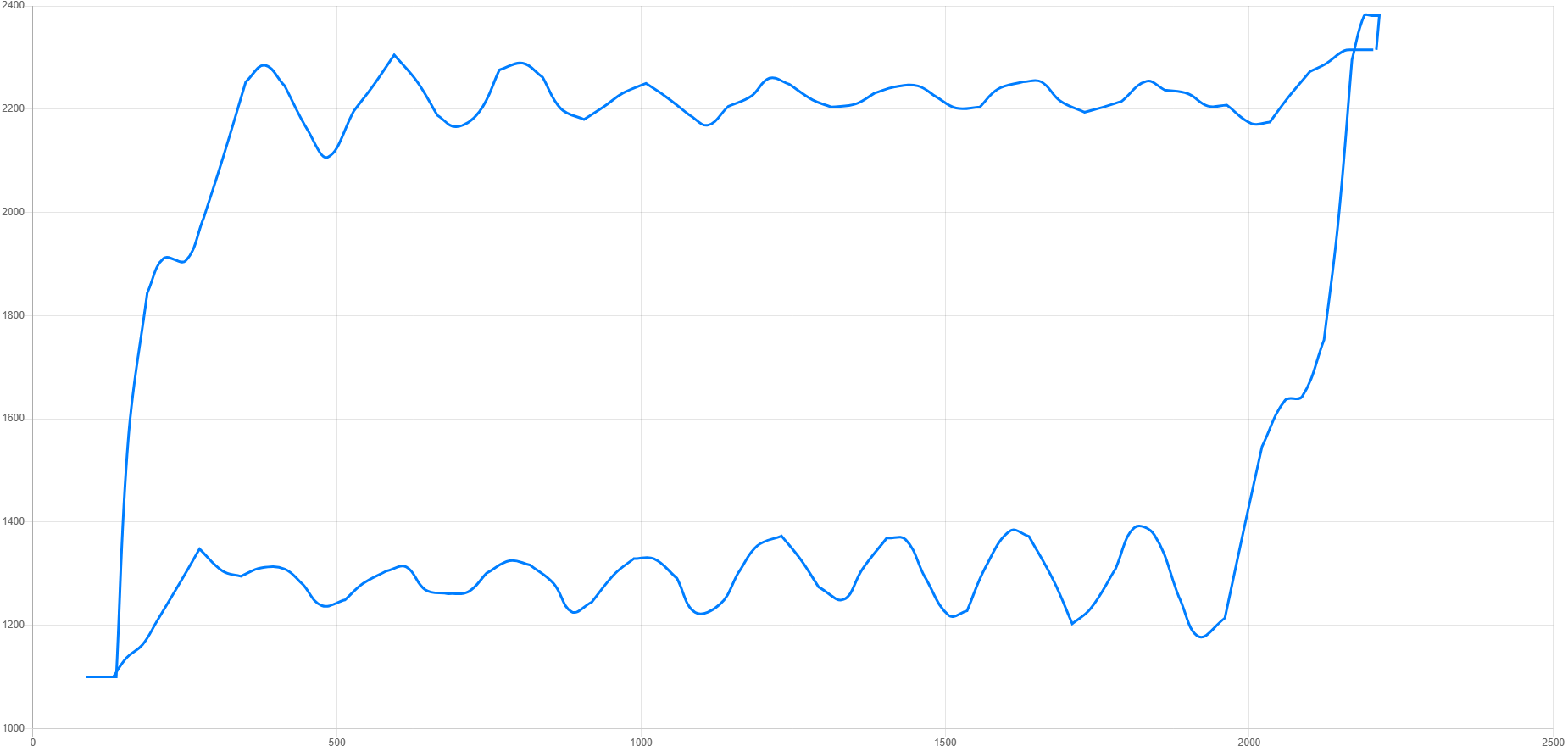
Is there a way to draw a line between datapoints in RadzenScatterSeries? I am trying to replicate a chart as seen below which was created using chart.js scatter chart.
Hello,
Is there a way to draw a line between datapoints in RadzenScatterSeries? I am trying to replicate a chart as seen below which was created using chart.js scatter chart.
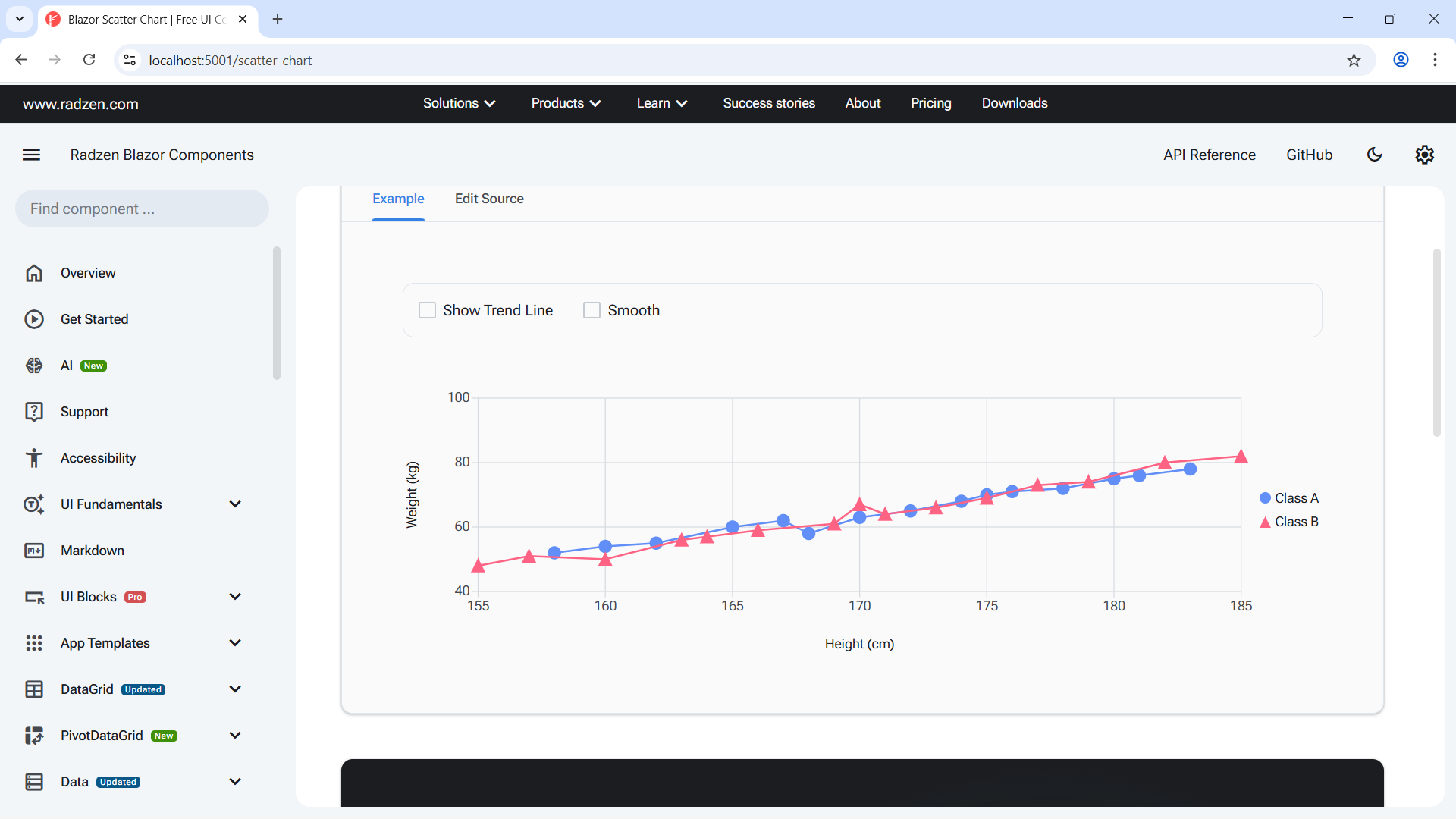
You can add markers in line series:
@using System.Globalization

<RadzenStack class="rz-p-0 rz-p-md-6 rz-p-lg-12">
    <RadzenCard Variant="Variant.Outlined">
        <RadzenStack Orientation="Orientation.Horizontal" AlignItems="AlignItems.Center" Wrap="FlexWrap.Wrap">
            <RadzenStack Orientation="Orientation.Horizontal" AlignItems="AlignItems.Center" Gap="0.5rem">
                <RadzenCheckBox @bind-Value="@showTrendLine" Name="trendLine"></RadzenCheckBox>
                <RadzenLabel Text="Show Trend Line" Component="trendLine" />
            </RadzenStack>
            <RadzenStack Orientation="Orientation.Horizontal" AlignItems="AlignItems.Center" Gap="0.5rem">
                <RadzenCheckBox @bind-Value="@smooth" Name="smooth"></RadzenCheckBox>
                <RadzenLabel Text="Smooth" Component="smooth" />
            </RadzenStack>
        </RadzenStack>
    </RadzenCard>

    <RadzenChart>
        <RadzenLineSeries Data="@classASorted" CategoryProperty="Height" ValueProperty="Weight" Title="Class A" Stroke="rgb(97,142,247)" Smooth="@smooth">
            <RadzenMarkers Visible="true" MarkerType="MarkerType.Circle" Size="6" Fill="rgb(97,142,247)" Stroke="rgb(97,142,247)" />
            <RadzenSeriesTrendLine Visible="@showTrendLine" Stroke="rgb(97,142,247)" LineType="LineType.Dashed" StrokeWidth="1" />
        </RadzenLineSeries>
        <RadzenLineSeries Data="@classBSorted" CategoryProperty="Height" ValueProperty="Weight" Title="Class B" Stroke="rgb(255,99,132)" Smooth="@smooth">
            <RadzenMarkers Visible="true" MarkerType="MarkerType.Triangle" Size="6" Fill="rgb(255,99,132)" Stroke="rgb(255,99,132)" />
            <RadzenSeriesTrendLine Visible="@showTrendLine" Stroke="rgb(255,99,132)" LineType="LineType.Dashed" StrokeWidth="1" />
        </RadzenLineSeries>
        <RadzenCategoryAxis>
            <RadzenGridLines Visible="true" />
            <RadzenAxisTitle Text="Height (cm)" />
        </RadzenCategoryAxis>
        <RadzenValueAxis>
            <RadzenGridLines Visible="true" />
            <RadzenAxisTitle Text="Weight (kg)" />
        </RadzenValueAxis>
    </RadzenChart>
</RadzenStack>

@code {
    bool showTrendLine = false;
    bool smooth = false;

    DataItem[] classASorted => classA.OrderBy(x => x.Height).ToArray();
    DataItem[] classBSorted => classB.OrderBy(x => x.Height).ToArray();

    class DataItem
    {
        public double Height { get; set; }
        public double Weight { get; set; }
    }

    DataItem[] classA = new DataItem[]
    {
        new DataItem { Height = 158, Weight = 52 },
        new DataItem { Height = 162, Weight = 55 },
        new DataItem { Height = 165, Weight = 60 },
        new DataItem { Height = 168, Weight = 58 },
        new DataItem { Height = 170, Weight = 63 },
        new DataItem { Height = 172, Weight = 65 },
        new DataItem { Height = 175, Weight = 70 },
        new DataItem { Height = 178, Weight = 72 },
        new DataItem { Height = 180, Weight = 75 },
        new DataItem { Height = 183, Weight = 78 },
        new DataItem { Height = 160, Weight = 54 },
        new DataItem { Height = 167, Weight = 62 },
        new DataItem { Height = 174, Weight = 68 },
        new DataItem { Height = 176, Weight = 71 },
        new DataItem { Height = 181, Weight = 76 },
    };

    DataItem[] classB = new DataItem[]
    {
        new DataItem { Height = 155, Weight = 48 },
        new DataItem { Height = 160, Weight = 50 },
        new DataItem { Height = 163, Weight = 56 },
        new DataItem { Height = 166, Weight = 59 },
        new DataItem { Height = 169, Weight = 61 },
        new DataItem { Height = 171, Weight = 64 },
        new DataItem { Height = 173, Weight = 66 },
        new DataItem { Height = 177, Weight = 73 },
        new DataItem { Height = 179, Weight = 74 },
        new DataItem { Height = 182, Weight = 80 },
        new DataItem { Height = 157, Weight = 51 },
        new DataItem { Height = 164, Weight = 57 },
        new DataItem { Height = 170, Weight = 67 },
        new DataItem { Height = 175, Weight = 69 },
        new DataItem { Height = 185, Weight = 82 },
    };
}
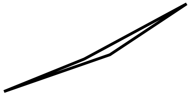
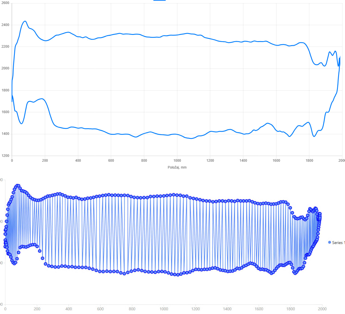
Using line series on a hysteresis curve does not help as the lines seem to be drawn between successive points on X-axis, and not between successive X-Y pairs. For data points as in the code snippet below, I would expect something like this:
@using System.Globalization

<RadzenStack class="rz-p-0 rz-p-md-6 rz-p-lg-12">
    <RadzenCard Variant="Variant.Outlined">
        <RadzenStack Orientation="Orientation.Horizontal" AlignItems="AlignItems.Center" Wrap="FlexWrap.Wrap">
            <RadzenStack Orientation="Orientation.Horizontal" AlignItems="AlignItems.Center" Gap="0.5rem">
                <RadzenCheckBox @bind-Value="@showTrendLine" Name="trendLine"></RadzenCheckBox>
                <RadzenLabel Text="Show Trend Line" Component="trendLine" />
            </RadzenStack>
            <RadzenStack Orientation="Orientation.Horizontal" AlignItems="AlignItems.Center" Gap="0.5rem">
                <RadzenCheckBox @bind-Value="@smooth" Name="smooth"></RadzenCheckBox>
                <RadzenLabel Text="Smooth" Component="smooth" />
            </RadzenStack>
        </RadzenStack>
    </RadzenCard>

    <RadzenChart>
        <RadzenLineSeries Data="@classASorted" CategoryProperty="Height" ValueProperty="Weight" Title="Class A" Stroke="rgb(97,142,247)" Smooth="@smooth">
            <RadzenMarkers Visible="true" MarkerType="MarkerType.Circle" Size="6" Fill="rgb(97,142,247)" Stroke="rgb(97,142,247)" />
            <RadzenSeriesTrendLine Visible="@showTrendLine" Stroke="rgb(97,142,247)" LineType="LineType.Dashed" StrokeWidth="1" />
        </RadzenLineSeries>
        <RadzenCategoryAxis>
            <RadzenGridLines Visible="true" />
            <RadzenAxisTitle Text="Height (cm)" />
        </RadzenCategoryAxis>
        <RadzenValueAxis>
            <RadzenGridLines Visible="true" />
            <RadzenAxisTitle Text="Weight (kg)" />
        </RadzenValueAxis>
    </RadzenChart>
</RadzenStack>

@code {
    bool showTrendLine = false;
    bool smooth = false;

    DataItem[] classASorted => classA;

    class DataItem
    {
        public double Height { get; set; }
        public double Weight { get; set; }
    }

    DataItem[] classA = new DataItem[]
    {
        new DataItem { Height = 100, Weight = 50 },
        new DataItem { Height = 120, Weight = 75 },
        new DataItem { Height = 140, Weight = 100 },
        new DataItem { Height = 110, Weight = 70 },
        new DataItem { Height = 100, Weight = 50 }
    };
}
From my original example (above is the scatter chart using chart.js, below is the line series)
Can you post your chart.js configuration for this chart?
Here it is.
// hex-encoded data strings.
// Each 4-character group represents one 16-bit value.
const xHexData = "0001000200030004";
const yHexData = "000A000B000C000D";

// Split into 4-character chunks
const xElements = xHexData.match(/.{4}/g);
const yElements = yHexData.match(/.{4}/g);

// Convert hex values to {x, y} points
const points = [];

for (let i = 0; i < xElements.length; i++) {
    const x = parseInt(xElements[i], 16);
    const y = parseInt(yElements[i], 16);
    points.push({ x, y });
}

// Create chart
const ctx = document.getElementById("chart").getContext("2d");

new Chart(ctx, {
    type: "scatter",
    data: {
        datasets: [{
            label: "Example dataset",
            data: points,
            showLine: true,
            borderColor: "rgba(0,123,255,1)",
            fill: false,
            pointRadius: 0
        }]
    },
    options: {
        scales: {
            x: {
                type: "linear",
                title: {
                    display: true,
                    text: "X axis"
                }
            },
            y: {
                title: {
                    display: true,
                    text: "Y axis"
                }
            }
        }
    }
});
At the moment there is no way to do that in our chart. We accept pull requests!