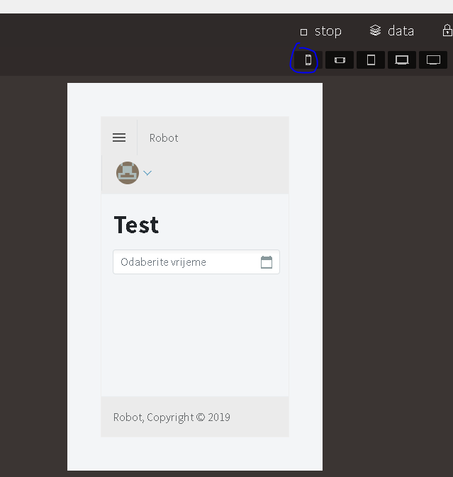
On default layout whit sidebar navigation when authentication enabled, profile menu and gavatar on small screens overlap first menu and top of displayed page.
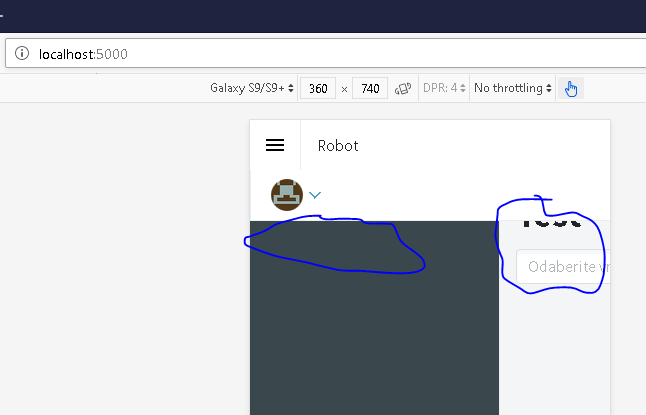
but in Chrome and Firefox simulator of mobile devices there is overlaping
In the moring from office I am going to try run app in vs so i can expose page to mobile and try on real mobile device
enchev
November 28, 2019, 6:50am
2
Yep, the sidebar should be closed by default on mobile devices. We will do our best to fix this soon!
3 Likes
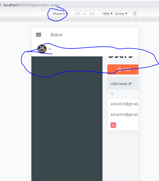
This happening on real devices also.
hello, any solution? same problem here
Jul 2020 same problem here
rolls
October 24, 2020, 11:22am
6
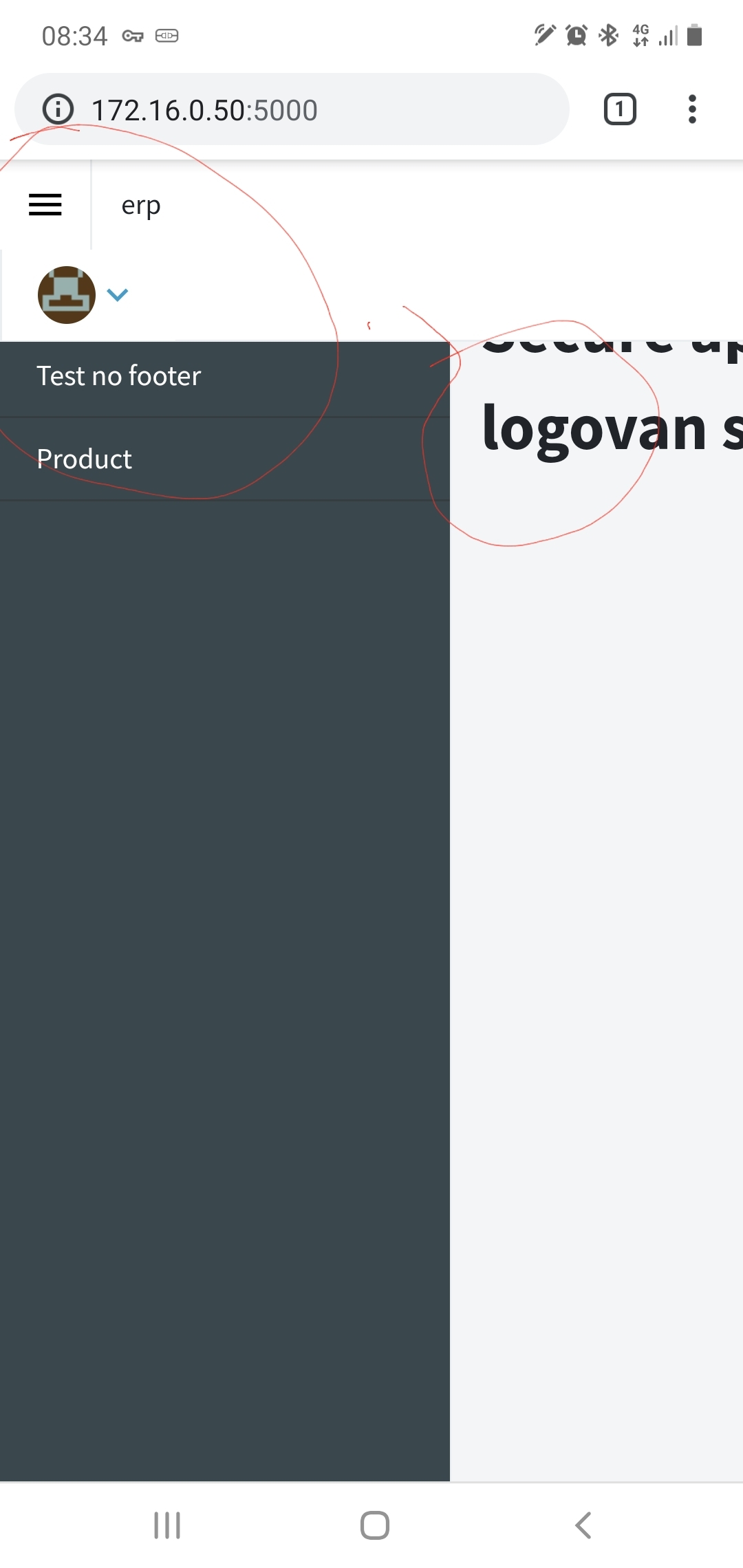
Same problem here too.Oct 2020
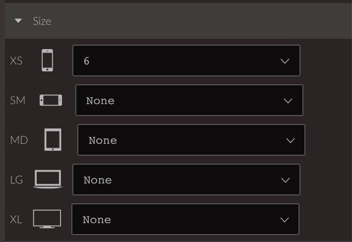
This can be fixed quite easily by changing the column size in the main layout from MD 6 to XS 6:
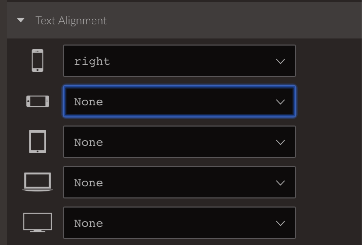
The second column also needs Text Align XS to be set to right as well.
We will update the built-in layouts with those changes so they take effect for new applications.
licitec
November 11, 2020, 5:26pm
8
Solved. Thank you very much!