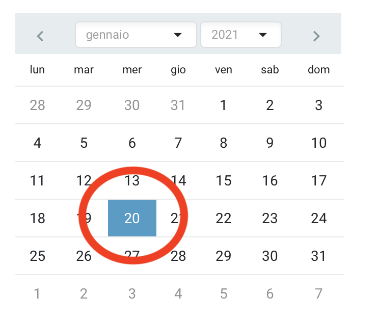
Very simple question: I would like to change the background color of the selected day in the inline DatePicker. In the basic css is like blue, and I would like to change.
I have learned that I can specify the style in the declaration of the component:
<RadzenDatePicker Style="" TValue="DateTime?" Inline="true" Change="@(args => OnChange(args, "Calendar", "MM/dd/yyyy"))" />
Which is the value that I need to declare in the Style to change the color?
Thank you for your help.
Hi @talentdotnet,
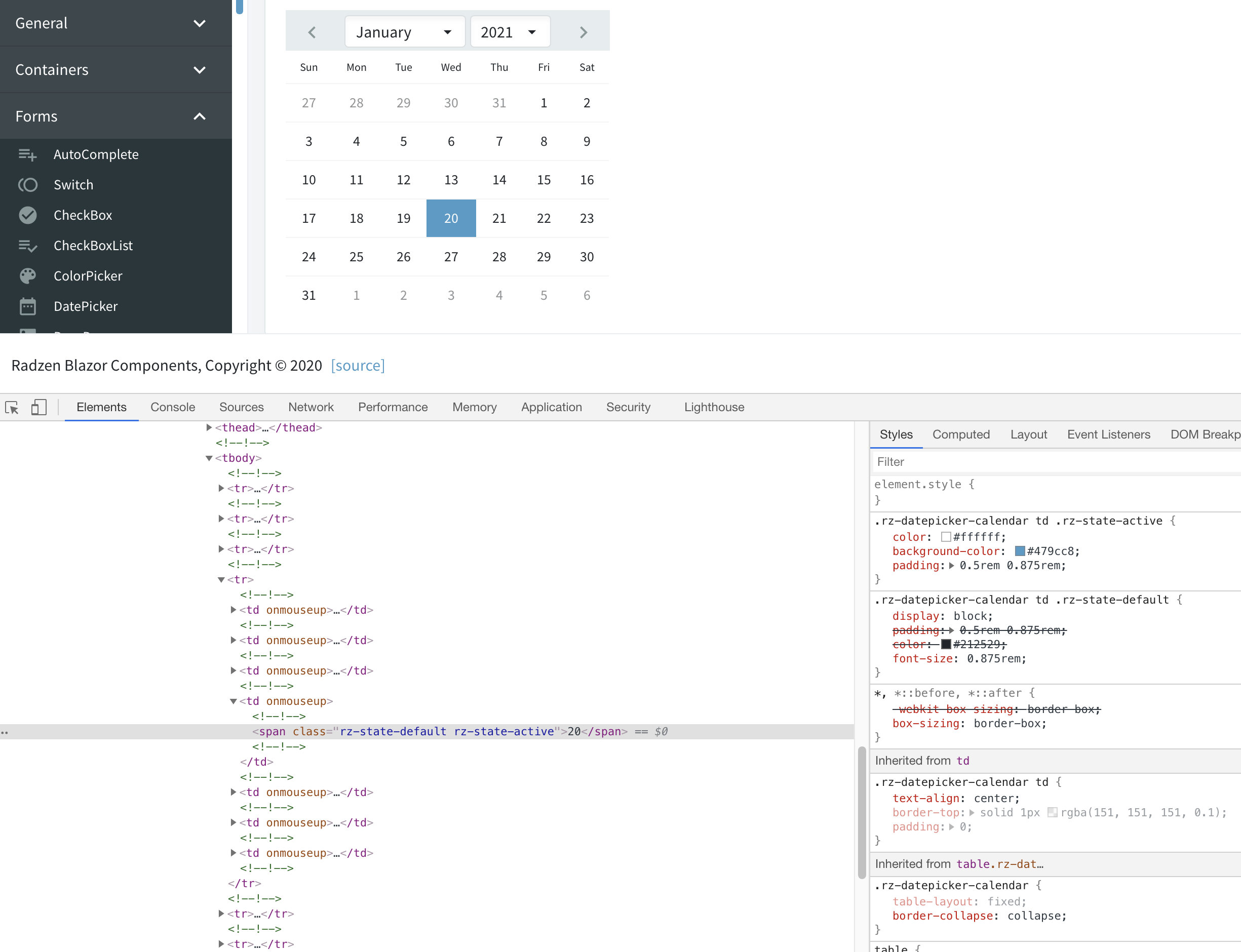
You can't change the selected style background from the Style attribute of the RadzenDatePicker element. It applies only to the outermost element. You can use your browser's developer tools to inspect the selected day and see which CSS classes specify the background color.
Then override that CSS rule with the desired background color:
.rz-datepicker-calendar td .rz-state-active {
   background-color: red;
}
Make sure you include this CSS rule after the Radzen theme. Or just use !important like this:
.rz-datepicker-calendar td .rz-state-active {
   background-color: red !important;
}
Thank you very much for your help! Your technique is very helpful! Could you please clearing me vere I have to override the css?
I think to have understood in the "_Host.cshtml" after the import of the css command:
<!-- RADZEN BLAZOR  -->
<link rel="stylesheet" href="_content/Radzen.Blazor/css/default-base.css">
Is it correct?
It should be safe to add that to the styles.css file in your Radzen application.
Thanks korchev, it works. The only thing that I have changed (for all who has the same problem) is the correct CSS rule to override, that is:
.ui-datepicker-calendar td .ui-state-active {
background-color: red !important;
}
".ui" and not ".rz"
Thanks a lot for your help friend.
You are using an older version of Radzen. The new prefix is 'rz'.