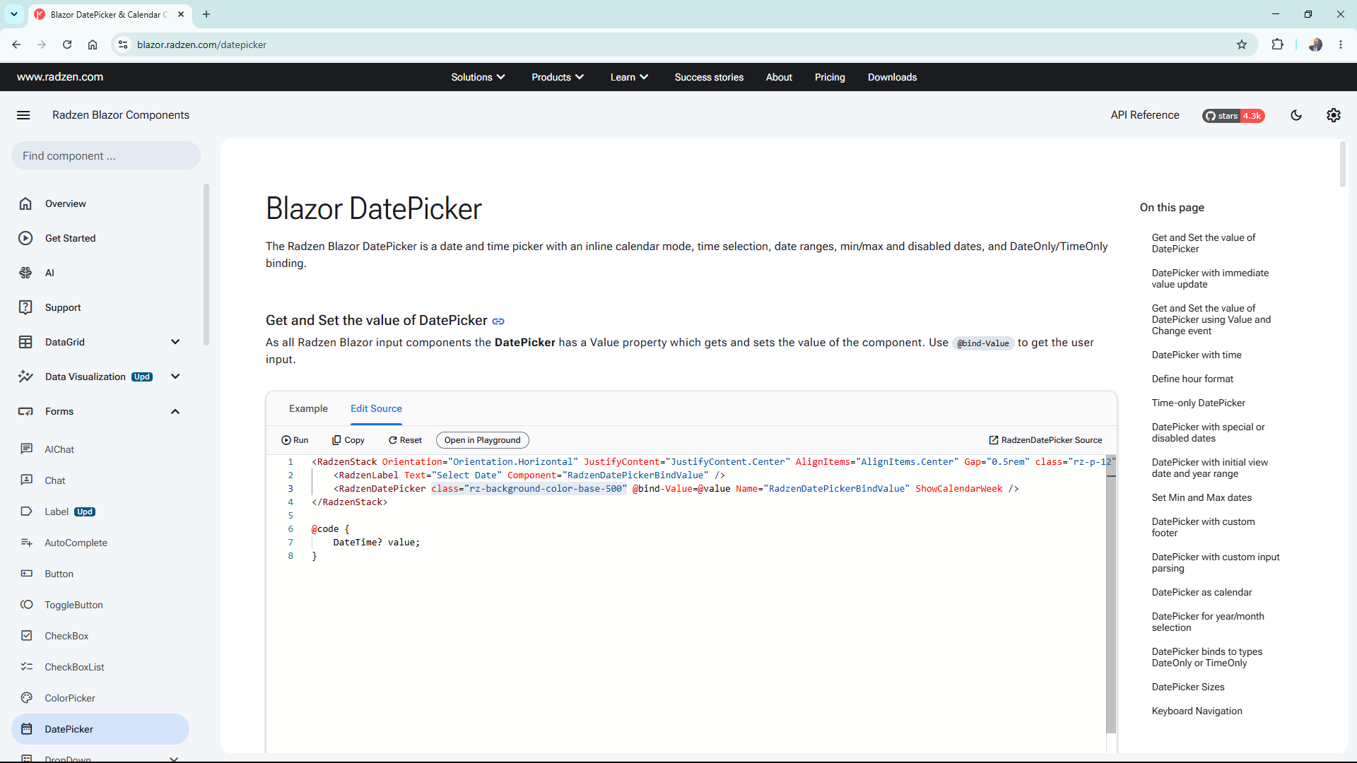
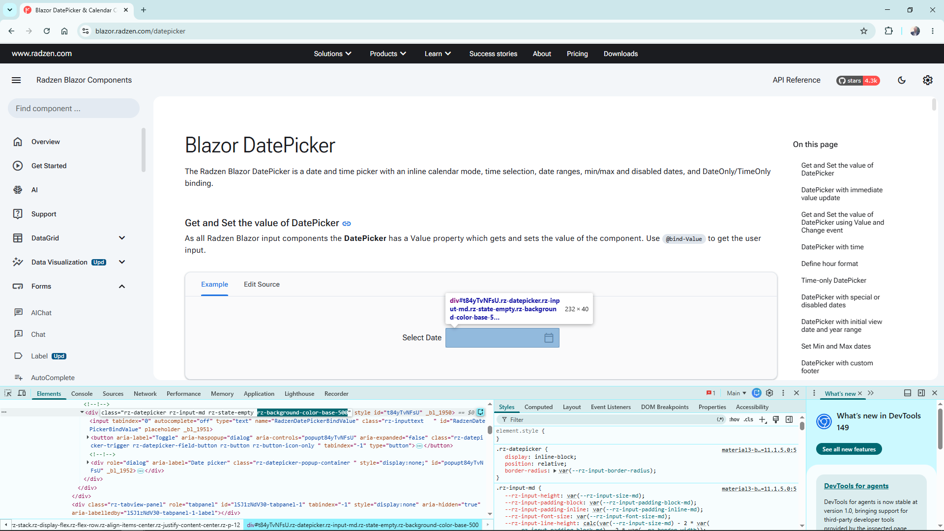
I was testing the DatePicker and it is the only one that does not follow the background color classes.
For example, let's say I would like to have the following:
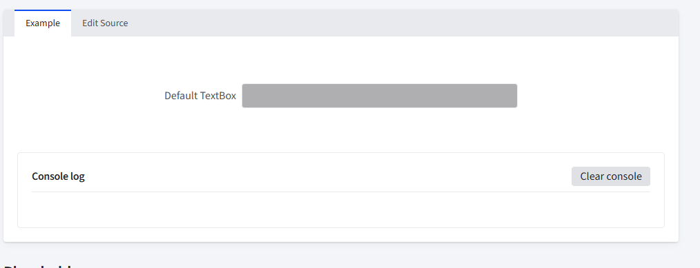
<RadzenStack Orientation="Orientation.Horizontal" AlignItems="AlignItems.Center" JustifyContent="JustifyContent.Center" Gap="0.5rem" class="rz-p-sm-12">
    <RadzenLabel Text="Default TextBox" Component="TextBoxBindValue" />
    <RadzenTextBox @bind-Value=@value Style="width: 100%; max-width: 400px;" Name="TextBoxBindValue"  class="rz-background-color-base-500" />
</RadzenStack>

<EventConsole @ref=@console />

@code {
    string value;

    EventConsole console;

    protected override void OnAfterRender(bool firstRender)
    {
        if (value != null)
        {
            console.Log($"Value changed to {value}");
        }
    }
}
You can test all input components, and they are able to follow those classes. However, when tenting the DatePicker is the only one that is not able to show it. See below:
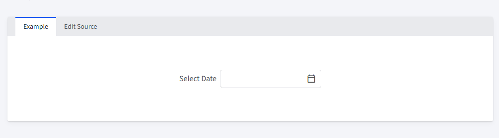
<RadzenStack Orientation="Orientation.Horizontal" JustifyContent="JustifyContent.Center" AlignItems="AlignItems.Center" Gap="0.5rem" class="rz-p-12">
    <RadzenLabel Text="Select Date" Component="RadzenDatePickerBindValue" />
    <RadzenDatePicker @bind-Value=@value Name="RadzenDatePickerBindValue"
    class="rz-background-color-base-500"  ShowCalendarWeek />
</RadzenStack>

@code {
    DateTime? value;
}
Could you please let me know if there is a way to implement this?
Regards