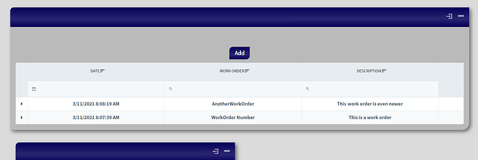
I love the Radzen Grid Component's ability to restructure to a compact display when the screen size is reduced for mobile display. Is there a way to force that mobile-friendly layout based on container width rather than viewport?
My current setup has the grid contained within a ViewComponent that fills roughly half of the screen:
The user has the option of expanding the ViewComponent to fill the majority of the page. I can't include a screenshot because I am a new user.
When the page loads and the parent ViewComponent is relatively narrow, I would like to force the DataGrid to display as it would on a mobile device (unless the user has one of those massive TV-sized monitors). I'm already checking the size of the parent component, so I can handle manually switching between view modes if there exists a switch on the DataGrid component that will force the compact mode.
Thanks

