Custom Button Integration in RadzenScheduler

Hi,

I was wondering if there is currently any option to add RadzenButtons to the RadzenScheduler as child content?

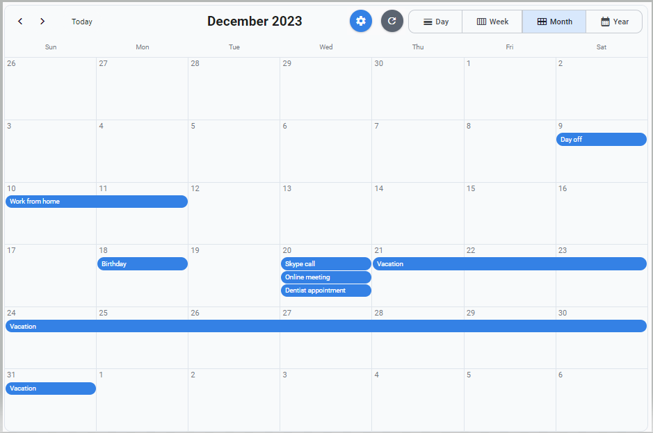
I am particularly interested in adding two buttons: one for managing settings and one to refresh/reset the scheduler.

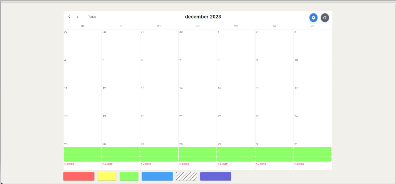
In my mind, I envision something like this:

If this feature is currently unavailable, I would like to request it as an enhancement to the RadzenScheduler component.

I'm particularly keen on having the ability to introduce custom buttons to the scheduler, enabling me to trigger events. While the existing buttons are great, for my use case, I only require the MonthView button, allowing space for additional buttons that I currently lack. The envisioned functionality encompasses the capability to open dialogs or initiate other actions in response to these button clicks, streamlining the management of filters I would like to apply.

This enhancement would offer me greater flexibility to tailor the scheduler to my specific requirements (or for others who may also want to use filters on their schedulers).

Should you have any questions or need additional clarification, please feel free to reach out. I appreciate your consideration of this possible request.

Kind regards,

Hi @Mr.Prog,

Such an option is not available. There isn't a way to add custom content. You can however place those buttons above or below the scheduler.

Hi @korchev,

Thank you for your prompt response.

I acknowledge your suggestion of placing buttons above or below the scheduler, yet I find it crucial to emphasize the need for an option to integrate custom buttons directly into the scheduler itself. In my experience, users typically expect such controls to be within the component, considering that other interactions, like navigating months and dealing with appointments, also occur inside the scheduler.

Let me illustrate this with a practical example:

Given certain constraints, such as limited space due to padding and page placement, placing numerous buttons around the page is not feasible. Below the scheduler, a legend provides specific details about visible items, and the sides are unavailable due to these limitations.

Within the component, the right uppermost corner offers ample space for custom buttons when the selectedIndex corresponds to the desired view. By hiding unnecessary buttons for the selected view (e.g. displaying only the MonthView button), I envision using this open space to incorporate custom buttons—potentially an Add, Settings, and/or Reset button.

Additionally, I anticipate a button or dropdown inside the scheduler for selecting the month and year. The current manual process of using the <> buttons to switch months/years could be streamlined with a dedicated control.

looking into recent developments, such as the introduction of the DatePicker for year/month selection,it appears there's room for improvement within the scheduler itself.

These considerations highlight aspects I currently miss in the RadzenScheduler, expecting them to be internal rather than external elements of the component.

If further clarification is required or if you have any questions, please feel free to reach out.

Kind regards,

Hey @Mr.Prog , I'm currently working on a Scheduler project. I know this isn't directly what you're referring to, but I thought it could help to mention that with some finagling, you can do quite a bit with the content inside date cells. Here is how I'm putting buttons inside of the cells:

            <RadzenScheduler AppointmentRender="@SchedulerAppointmentRender" Data="@viewEventItems" EndProperty="EndTime" @ref="@scheduler" SelectedIndex="2" SlotRender="@OnSlotRender" AppointmentSelect="@OnAppointmentSelect" SlotSelect="@OnSlotSelect" StartProperty="StartTime" Style="height: 768px" TextProperty="Subject" TItem="Models.EventsData.ViewEventItemsFull">
                <Template Context="data">
                    <RadzenStack JustifyContent="JustifyContent.SpaceBetween" Orientation="Orientation.Horizontal" Style="align-items: flex-start !important;">
                        <RadzenButton @onclick:stopPropagation title="Quick View" Click="@(() => OnViewButtonClick(data))" Icon="open_in_full" Size="ButtonSize.ExtraSmall" Variant="Variant.Text" Style="padding-top: 2px" IconColor="DarkSlateGray"  />
                        @data.Subject
                        <RadzenButton @onclick:stopPropagation title="Delete this Event" Click="@(() => OnDeleteIconClick(data))" Icon="clear" Size="ButtonSize.ExtraSmall" Variant="Variant.Text" Style="padding-top: 2px" IconColor="DarkSlateGray"/>
                    </RadzenStack>
                </Template>
                <ChildContent>
                    <RadzenDayView></RadzenDayView>
                    <RadzenWeekView></RadzenWeekView>
                    <RadzenMonthView></RadzenMonthView>
                </ChildContent>
            </RadzenScheduler>

image
image
The button on the left brings up a dialog displaying a quick view panel, the button on the right deletes the event.

Good luck,
SloSuenos

2 Likes

Hi @SloSuenos ,

Thank you for your valuable contribution to this conversation; it's greatly appreciated.

It's fantastic to see that you've explored and implemented additional interactions within the scheduler elements. In my own demo, I also leverage display texts and color coding based on the objects' deadlines, among other use cases. The scheduler plays a crucial role in organizing tasks by date in my application, allowing users to easily identify open tasks for a specific period in a month. Hence, having extensive control over the scheduler is imperative. Given that most user interactions occur within the scheduler, the ability to add custom buttons to the header for triggering events such as Filters/Resets or Settings becomes a significant requirement.

If you haven't come across it yet, the Radzen team recently extended the scheduler by introducing a tooltip hover effect on appointments for a quick preview (Display additional content on user hover). Assuming your quick view panel is primarily used for checking the contents of appointments, this enhancement could be a valuable addition, providing users with a quick preview without the need for additional clicks.

In my design philosophy, I strive to minimize clicks for users, aiming for an intuitive and efficient experience. This tooltip feature aligns perfectly with this approach, allowing users to access information swiftly and effortlessly.

Currently, I am eagerly anticipating further responses from the Radzen team regarding the possibility of incorporating custom buttons into the header, potentially replacing the standard buttons. Notably, in my scenario, where displaying only the month view is a constant requirement, the default buttons in the upper-right corner become unnecessary. This creates an opportunity to allocate that space for custom buttons, tailored to specific use cases, making the scheduler even more streamlined and user-friendly.

Looking forward to your insights and further developments.

Best regards,

Mr.Prog

1 Like

Hello @Mr.Prog, thank you for the kind words.

I had tooltips working adequately with scheduler some time ago, but it took some work. I knew improvements for scheduler tooltips were forthcoming and have been watching the "What's new" page, but must have somehow missed it.

Still, I prefer code-behind pages and my quick view dialog displays a lot of data. I spent some time down the RenderFragment rabbit hole and decided it was just too much. Also, I didn't feel that a tooltip could be performant rapid-fire loading so much data.

I'm passing a whole record over to my quick view dialog as a parameter, instead of querying for it on load in the dialog itself and this seems to work well, though may be considered a bad practice.

I do need to put together a color legend as you have done and am considering how to do it without hardcoding label text and color names. I dislike eating up the additional screen space too. Perhaps we should request that the Radzen Developers add in an automatic legend into the Scheduler itself much the same way as I believe their chart components have?

Keeping Scheduler date cell contents lined up and looking nice, especially when they contain additional elements such as buttons, etc. took some effort, and that's the reason I wanted to show you what I'd done so far.

However, when two scheduled events have overlapping dates and times, some information such as my delete button are not being displayed, thanks to the additional event content stuff I've added.
image
I haven't really taken a stab at fixing this yet. Is this an issue for you?

Have you provided the ability at add multiple events at once? The client I'm coding this for needs the ability to add many dozens, and of course it's necessary to also provide event conflict checking. The Radzen Scheduler API does a GetAppointmentsInRange method that could facilitate conflict checking, but I opted to send the list of event dates to a SQL Stored Procedure as a JSON string for both conflict checking and batch saves and let the database do the work.

Enjoying our discussing Radzen Scheduler challenges and conquests,

SloSuenos