I have a question because me and my coworker have been unable to find a proper solution. We utilize Tailwind for styling, and have been working to implement dark mode into our website. The Tailwind side of things was straightforward and is complete, but Radzen has been proving more challenging. Stripping out many of the hard coded color values from the SCSS has solved the majority of issues, but we have run into a wall when it comes to Radzen markup that implements additional objects that require styling. For example tabs, datepickers, and dropdowns.
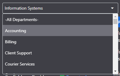
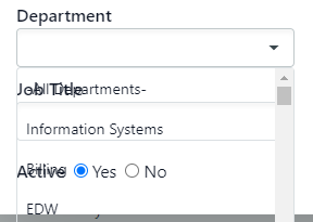
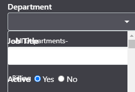
Below is a drop down, Tailwind picks up for the base input box but passing classes does nothing to control the CSS for the dynamically created drop down. Removing the CSS colors simply made it transparent. Is there a way we can pass CSS values to the markup so we can control the bg, text, hover, and select like options for objects?
<RadzenDropDown TValue="int" Data=@departments TextProperty="DepartmentName" ValueProperty="DepartmentId"
                                @bind-Value=departmentID class="bg-white text-gray-900 dark:bg-zinc-700 dark:text-white w-96" Change="DepartmentChanged" />