Hi,
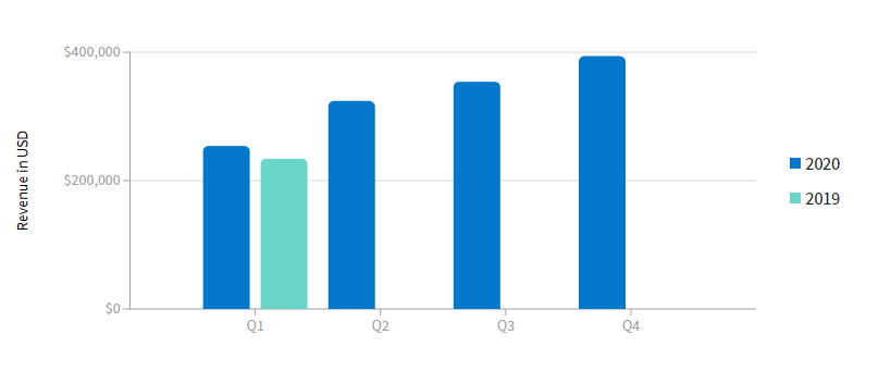
I modified the example coded for ColumnChartPage.razor and got below chart, it doesn't look correct?
    DataItem[] revenue2019 = new DataItem[] {
    new DataItem
    {
        Quarter = "Q1",
        Revenue = 234000
    },

};

DataItem[] revenue2020 = new DataItem[] {
    new DataItem
    {
        Quarter = "Q1",
        Revenue = 254000
    },
    new DataItem
    {
        Quarter = "Q2",
        Revenue = 324000
    },
    new DataItem
    {
        Quarter = "Q3",
        Revenue = 354000
    },
    new DataItem
    {
        Quarter = "Q4",
        Revenue = 394000
    },

};
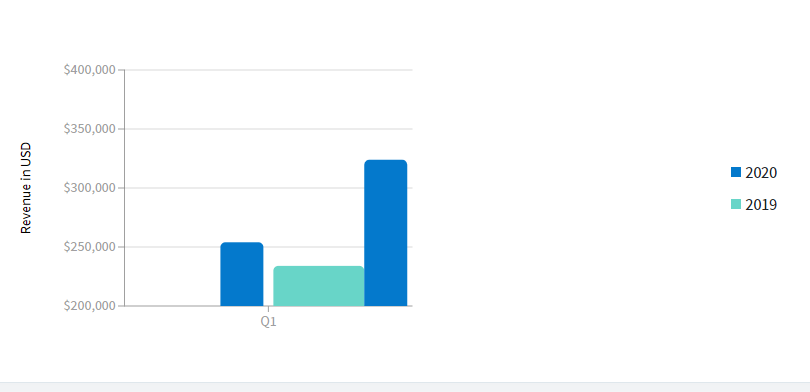
I would expect below ( but with better scaling i filled the empty with 0):
/Thomas