It would be really cool if we could have have the panel menu to an intermediate state where only icons are visible (ala Fluent I guess?) - but native.
Any word on v3? 
It would be really cool if we could have have the panel menu to an intermediate state where only icons are visible (ala Fluent I guess?) - but native.
Any word on v3?
Hey @Rich_Jeffries,
Our components are released every week or even twice a week, we don’t have to wait for the Radzen 3 release! We accept also pull requests!
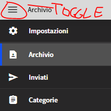
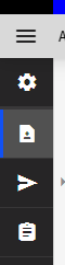
We are trying to work the Radzen sidebar menu into our new application as we are using many other components from the rich library, but we need better functionality in regards to a minimised icon state. Is there any news on when this would be available?
A really valuable addition that I'm sure many others product designers want.
The project we work on also implements the panel menu as a sidebar. We have been asked by the business users if it's possible to partially display the menu items as icon only. This feature would be great as an option. Efficient use of space without hiding the menu completely.
This feature isn't on our immediate roadmap. We would accept a pull request implementing it though. Just a quick clarification - the component that is collapsible is RadzenSidebar not RadzenPanelMenu. This feature needs to be supported by RadzenSidebar and then RadzenPanelMenu should render only icons (probably via cascading CSS classes).
Yes, RadzenSidebar to collapse to icons only. Apologies for confusion.
Based on the idea of GodzSky, I came up with another solution.
It works as follows:
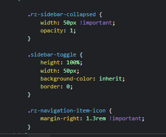
Here is the style sheet for it, which has to be applied before the Radzen theme.
/* make sidebar narrow to only show the icons */
.rz-sidebar-expanded {
    width: 50px !important;
}
/* add margin to the text to hide it */
.rz-sidebar-expanded .rz-navigation-item-text {
    margin-left: 1.25rem !important;
}

/* make sidebar wide when hovered to show the text as well */
.rz-sidebar-expanded:hover {
    width: 200px !important;
    margin-right: -150px !important;
}
/* unset margin of the text to show it */
.rz-sidebar-expanded:hover .rz-navigation-item-text {
    margin-left: unset !important;
}

/* hide vertical scrollbar */
.rz-sidebar-expanded .rz-panel-menu {
    overflow-x: hidden !important;
}
To expand on the efforts of Djezze, I have created a more "radzen variable" friendly version of the CSS. The width of the sidebar icon-only-view is based on the width of the sidebar toggle area.
The code below also allows for the transition animation to work smoothly. It will keep your menu items to a single line of text.
Additionally, by including the @media, it should allow you to adjust to different breakpoints. Here, the panel goes from icon-only to full width at the "large" breakpoint.
/*SideBar Icon Expanded*/
/*Define sidebar width variable*/
:root {
    --rz-sidebar-icon-width: calc(2 * var(--rz-sidebar-toggle-padding) + var(--rz-sidebar-toggle-icon-width) + var(--rz-border-width));
}
/*Keep the Navigation text from wrapping when transitioning*/
.rz-navigation-item {
    white-space: nowrap;
}

/*Determines when the UI becomes icon only*/
@media (max-width: 1279px) {
    /*Set the width when icon only*/
    .rz-sidebar-expanded {
        width: var(--rz-sidebar-icon-width);
    }
        /*Hide the text elements*/
        .rz-sidebar-expanded :is(.rz-navigation-item-text, .rz-navigation-item-icon-children) {
            width: 0px;
            opacity: 0;
        }
        /*Expand the sidebar on hover*/
        .rz-sidebar-expanded:hover {
            width: var(--rz-sidebar-width);
            margin-right: calc(-1 * (var(--rz-sidebar-width) - var(--rz-sidebar-icon-width)));
        }
            /*Show the text elements on hover*/
            .rz-sidebar-expanded:hover :is(.rz-navigation-item-text, .rz-navigation-item-icon-children) {
                width: unset;
                opacity: unset;
            }
}
If you want to maintain the icon bar width, as the display gets smaller, you'll need to add the following CSS as well...
@media (max-width: 768px) {
    .rz-body {
        width: unset;
    }
}
In addition to adding the above I made some modifications so that when the menu is smaller than 576px, the menu will be full screen for touch. This is a bit more complex as I had to use JS injection to get the size of the display.
In the code above the line @media (max-width: 1279px) becomes
@media (min-width: 576px) and (max-width: 1279px)
In order for the breakpoint to work add...
@media (max-width: 575px) {
    .rz-sidebar-expanded {
        width: 100vw;
        margin-right: -100vw;
    }
    .rz-sidebar-collapsed {
        border-right-width:0px;
    }
}
I could use a bit of help with the below, as I'm more of a CSS person than a Blazor/C# guru...
I wanted the UI to close when the user clicked on any icon that had a path. I also didn't want the Menu UI to close if the screen was not smaller than 576px.
Inject IJSRuntime to invoke a JavaScript function.
If the Nav Menu is in the same component as the layout component use the following:
 <RadzenLayout @ref=@layout>

@code {
   private RadzenLayout layout = default!
}
If your Nav Menu is in it's own component use the following.
@code {
    [CascadingParameter]
    public RadzenLayout layout { get; set; }

    [Parameter]
    public bool Expanded { get; set; }
    [Parameter]
    public EventCallback<bool> ExpandedChanged { get; set; }
}
Add the method to close the panel
private async Task NavClick()
    {
            if (layout != null)
        {
            // call the javacript method that will be returing something.
            var dimensions = await JSRuntime.InvokeAsync<string>("getDimensions", layout.UniqueID);

            // I've used a dynamic type object so that I don't need to create a custom class to deserialize it.
            dynamic d = Newtonsoft.Json.JsonConvert.DeserializeObject<dynamic>(dimensions);
            if (d is not null)
            {
                int width = d.width;
                if (width <= 576)
                {
//If the method is in the same component as the Layout
                    sidebar1Expanded = false;
//If the method is in the nav menu component.
                    await ExpandedChanged.InvokeAsync(false);
                }
            }
        }
    }
//For each RadzenPanelMenuItem with a Path you'll want to add the following Click function
Click="@(async()=>{await NavClick();})"
In the Component with the RadzenLayout bind your Expanded parameter to the parameter used by the sidebar
<NavMenu @bind-Expanded="@sidebar1Expanded" />
Add the following to your site.js
function getDimensions(element) {
    return JSON.stringify(document.getElementById(element).getBoundingClientRect());
}
Without extending the RadzenPanelMenuItem class, I could not help but to add the Click function to each component. Any tips?