Dear Community,
I have a problem with the LineChart. I have three data list, each of them are list of datetime/value pairs. Two of them contains usually many data, like 4-500, the third one only 5. When I get the data from the database, I ensure in the post-processing state that the data list is ordered, and the first and the last record in each list has the minimum date of the three, that last is the maximum one. This means that theoretically if I display the data in top of each other, the x axis should be the same (this is important, because it displays a process ran recently). In case I have many data, this works. However, in case of the few data, despite of that the first data point's datetime value is exactly the same as the value in the other two lists, and the last as well, the diagram is not shown correctly. I didn't find any tag which would have helped to "stretch" the diagram to be in the correct form.
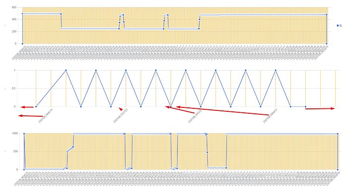
I try to show the problem in the below image.
Thank you very much for any help in advance!
Zsolt
Hi @zsolttrenyik,
I am afraid I didn't understand much from your post. For example I don't know what the expected result is and what the problem is. I suggest checking the forum FAQ for tips how to improve your post.
Thank you for your feedback!
The data lists appear in separate diagram, below each other, but the time frame (x axis) must be the exactly the same.
1st data list to show: (I have records every 10 minutes in the time frame)
2025.01.01. 00:00:00 / 1
2025.01.01. 00:10:00 / 2
...
2025.01.01. 07:50:00 / 290
2025.01.01. 08:00:00 / 300
2nd data list to show: (I have a few records/points in the timeframe)
2025.01.01. 00:00:00 / 1
2025.01.01. 02:00:00 / 2
2025.01.01. 04:00:00 / 2
2025.01.01. 07:00:00 / 3
2025.01.01. 08:00:00 / 4
3rd data list to show: (I have records every 10 minutes in the time frame)
2025.01.01. 00:00:00 / 100
2025.01.01. 00:10:00 / 200
...
2025.01.01. 07:50:00 / 2900
2025.01.01. 08:00:00 / 3000
All the points should appear in the correct absolute position, according to the x value of the data points (datetime). However, if you look at the screenshot, it is not the case, despite of the correct data in all three lists.
I hope this example helps to understand my problem.
Thank you!
My chart in the razor view:
<RadzenChart Style="width: 100%; height: 250px;">
<RadzenLineSeries Smooth="@smooth" Data="@chamberThirdParamDataArr" CategoryProperty="DateAndTime" Title="@SelectedThirdParamToChart" ValueProperty="Value">
<RadzenMarkers Visible="@showMarkers" MarkerType="MarkerType.Circle" />
<RadzenSeriesDataLabels Visible="@showDataLabels" />
</RadzenLineSeries>

<RadzenCategoryAxis Padding="20" TickDistance="@DiagramTickDistance" Visible="true" Formatter="@xAxisLabelFormat" LabelAutoRotation="-45">
<RadzenGridLines Visible="true" Stroke="#FFA500" />
</RadzenCategoryAxis>

<RadzenValueAxis Formatter="@yAxisLabelFormat">
<RadzenGridLines Visible="true" Stroke="#CCCCCC" />
<RadzenAxisTitle Text="..." />
</RadzenValueAxis>
</RadzenChart>
I don't know what the correct absolute position is. I also don't know the type of DateAndTime. However if it is DateTime RadzenChart will interpolate values. You can use a string property for the category (just the string representation of your dates). Then no interpolation would happen.
Thank you!
This is one point in the list which I display:
public class NumDataItemForRadzenChart
{
	public string DateAndTime { get; set; }
	public double Value { get; set; }
	public int id { get; set; }
}
DateAndTime is the x value, Value is the y value in the chart.
