Hi,
On our business a Polar chart is crucial for us to demonstrate how the light spreads from a fitting. Many other libraries usually have a spider chart which doubles down as a polar chart. Is there any way you would add this chart in as a new feature?
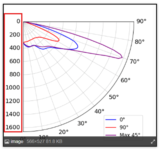
Here’s an example of a final image, we do use libraries that allow us to crop the polar graph and only show the required part. We currently do this in Python but would be a massive incentive to move to Radzen (which is already looking very polished!).
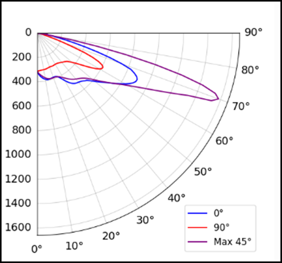
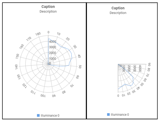
A normal chart will look like the image on the left, which in essence we then crop it to something like the image on the right.
This is just a demonstration from another library we where testing, would still need a couple changes to get to the final example.
Just so you get a better idea, this how this last image was setup on this library.
ChartXAxis xAxis = new ChartXAxis()
{
   ...
    UnitInterval  = 10,
    ValuesOnTicks = true,
    Labels = new ChartLabels()
    {
        AutoRotate = true
    },
    MinValue = 0,
    MaxValue = 90,
    Flip = true,

};

List<ChartSeriesGroup> seriesGroups = new List<ChartSeriesGroup>()
{
    new ChartSeriesGroup()
    {
...
        Polar             = true,
        Radius            = 120,
        StartAngle = 90,
        EndAngle = 180,
      ...
    }
};