IanKing
September 19, 2022, 5:34pm
1
I am using your Blazor accordion.
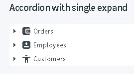
Using the same code I get a much different view with no box and small expanders on the left.
Is it possible to style like your example of is that just old code that has been replaced?
enchev
September 19, 2022, 5:37pm
2
You’ve missed to include desired theme CSS file. Check the Getting started for reference:https://blazor.radzen.com/get-started
korchev
September 19, 2022, 5:50pm
3
You could also be using an older version (prior 4.0.0) or a different theme (our online demos use the Material theme at the moment). Make sure your Radzen.Blazor installation is up-to-date.
IanKing
September 19, 2022, 6:09pm
4
That does add the white effect but by greying the rest of the page.
That's fine. I will live with it. Not going to re-style the entire site for a couple down chevrons.
IanKing
September 19, 2022, 6:11pm
5
Oh, and yes, it is 4.0.0
korchev
September 19, 2022, 8:14pm
6
You need to use the Material theme by including the material.css file (or material-base.css) in your application.
Yogi
June 21, 2024, 10:27am
7
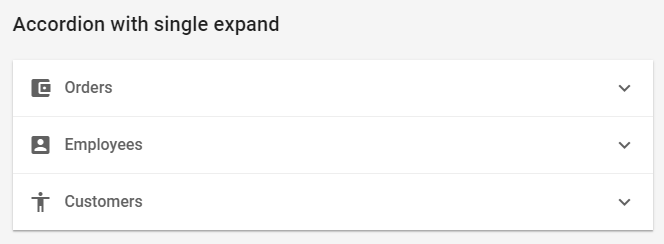
Hi @korchev Is it possible to achieve the Material theme Accordion style with Fluent and Fluent dark theme. ?
Hi @Yogi ,
No, this isn't possible. You can only use a single theme.
Hi @Yogi ,
Moving the expand/collapse arrow to the right is possible by setting --rz-accordion-toggle-icon-order: 1;.
You will need additional CSS to change the arrows and add borders:
<RadzenAccordion Class="material-accordion">
    <Items>
        <RadzenAccordionItem Text="Orders" Icon="account_balance_wallet" CollapseTitle="Collapse orders."
                             ExpandTitle="Expand orders." CollapseAriaLabel="Collapse the order details."
                             ExpandAriaLabel="Expand the order details.">
            Details for Orders
        </RadzenAccordionItem>
        <RadzenAccordionItem Text="Employees" Icon="account_box" CollapseTitle="Collapse employees."
                             ExpandTitle="Expand employees." CollapseAriaLabel="Collapse the employee details."
                             ExpandAriaLabel="Expand the employee details.">
            Details for Employees
        </RadzenAccordionItem>
        <RadzenAccordionItem Text="Customers" Icon="accessibility" CollapseTitle="Collapse customers."
                             ExpandTitle="Expand customers." CollapseAriaLabel="Collapse the customer details."
                             ExpandAriaLabel="Expand the customer details.">
            Details for Customers
        </RadzenAccordionItem>
    </Items>
</RadzenAccordion>

<style>
    .material-accordion {
        --rz-accordion-toggle-icon-order: 1;
        --rz-accordion-item-border: var(--rz-border-base-200);
        .rz-accordion-toggle-icon.rzi-chevron-right:before {
            content: "keyboard_arrow_down";
        }

        .rz-accordion-toggle-icon.rzi-chevron-down:before {
            content: "keyboard_arrow_up";
        }
    }
</style>