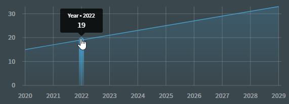
Request to customize the field names when hovering over the chart / selecting a plot in the graph. Right now instead of showing "Hours" for a specific year (IE: "Hours: 19") it shows "Year: 19". This is causing a bit of transparency issues on our app.
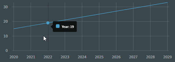
When selecting an individual plot, it is a little bit better: