I have encountered an issue with the responsiveness of the Pager layout for the datagrid
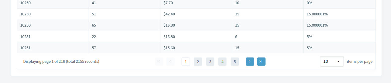
When I have all the options for the pager enabled (pager summary and page size options), it looks like this in desktop mode:
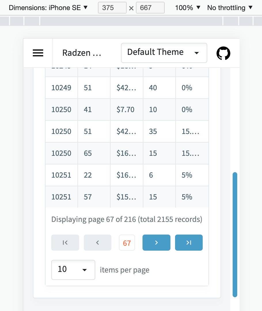
but when you scale the page to a mobile layout, it looks like this:
Which, as you can probably tell, isn't super useable.
Is there a css workaround I could use to make them become vertically separated until a fix is made that makes the process automatic?
Hey @JosoIce, try adding the following CSS rules:
@media (max-width: 768px) {
    .rz-paginator {
        display: grid;
        grid-column-gap: 0.5rem;
        grid-row-gap: 1rem;
        grid-template-columns: repeat(9, 1fr);
        text-align: center;
    }

    .rz-paginator-summary {
        grid-column: 1/10;
        padding: 0 !important;
        text-align: left;
    }

    .rz-paginator-first {
        grid-column: 1/3;
        margin: 0 !important;
    }

    .rz-paginator-prev {
        grid-column: 3/5;
        margin: 0 !important;
    }

    .rz-paginator-pages {
        grid-column: 5/6;
        margin: 0 !important;
    }

    .rz-paginator-next {
        grid-column: 6/8;
        margin: 0 !important;
    }

    .rz-paginator-last {
        grid-column: 8/10;
        margin: 0 !important;
    }

    .rz-paginator .rz-dropdown {
        grid-column: 1/4;
        width: auto;
        margin: 0 !important;
        text-align: left;
    }
    .rz-paginator .rz-pagesize-text {
        grid-column: 4/10;
        margin: 0 !important;
        text-align: left;
    }
}
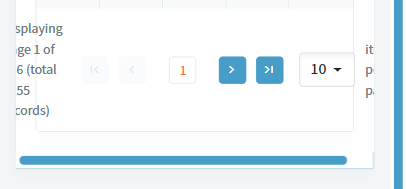
With the above styles applied, the Pager should look like this:
1 Like