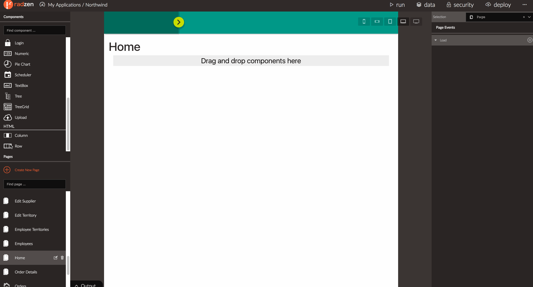
I need to have three DataGrids arranged horizontally (in columns) on a page. When I drag a new grid to the page it always stacks vertically. Would you provide the steps needed to create grids horizontally on the page?
Indeed the default behavior is to stack grid components vertically. To achieve column layout follow this procedure:
- Scroll the toolbox to the bottom
- Add a row component. A row contains columns. Every column occupies has a size. If total sum of column sizes is less than or equal to 12 the columns will appear on the same row.
- Drag and drop a column component. Set its size to 4.
- Repeat step 3 two more times. Now you will have three equally sized columns in horizontal layout.
- Drag and drop a grid component in every column.
More info about the layout features of Radzen can be found here.
Thanks Korchev. After following these steps, the grids still render down instead of across upon running the app. Any ideas?
@joshbooker @larrywhite unfortunately, yes - the grids will appear vertically stacked. A CSS class is missing from the generated code. Just released Radzen 1.16.6 which addresses that.
thanks @Korchev. Would it make sense to add {height:100%; width:100%} to all Radzen controls so that they flex with the columns & rows? For example, when I drop a button on a column, it doesn’t flex to column width by default.
@joshbooker we are not doing that on purpose because there a cases one may not want that - e.g. having more than one component in a column. You should be able to set Width and Height from property grid though.
Thanks for your reply. I tried setting w&h to 100% in the properties and it doesn't render properly in the designer, but does indeed flex in the generated app.
What about wrapping all controls in rows and columns by default. The example of more than one component in a column could be handled by a row with two columns in side the parent column.
This is one thing that made screen design in lightswitch so simple yet powerful. Everything on the screen was inside row and column containers and everything flexed by default.
Refer back to this idea:
@joshbooker Wrapping all controls in rows and columns was something we used to do until recently. However it had some unavoidable limitations:
- Inability to specify exact pixel (or other unit) size of the components.
- Inline elements (buttons, textboxes etc) flexed too which just looked odd.
We are avoiding custom layout implementations and decided to adopt a well known one such as Bootstrap. It still uses rows and columns with the added benefit of being responsive.
You are right that setting the button width and height to 100% doesn’t flex in the designer. We will fix that.
Thanks again for your reply. It’d be swell if we could turn on/off the design-time wrapping of controls in col\rows. Doing it manually drag n drop is a pain. I find it rather difficult to know where you’re dropping in order to get the nested row\col\row\col just right.
Do the generated pages no longer wrap in row\col as well? Hope not.
The generated pages use rows and columns by design. You are right that it is sometimes not clear where something will drop. We will try to add some visual hints to indicate that and improve the user experience.